Yesterday, I spent hours trying to choose the perfect white for my bathroom walls.
When I shared on Facebook, all your comments made it apparent I’m not the only one who has a hard time picking this neutral! You’d think choosing a white paint would be much easier than a ‘real’ color, but for many of us, it’s the exact opposite!
This is because white is not really white and it’s whats underneath that counts!
The underlying color(s) that are added in small amounts are what gives a white paint its unique character. Yellow undertones create a warm white where as blue undertones create a cool white. Then there’s also red and green undertones that give another totally different hue. Now add on how natural and artificial light and the paints sheen affect the look, and this explains why choosing the perfect white is both fun and frustrating at the same time! So, before committing to a white paint, here are three things to keep in mind:
- Lighting
- Undertones
- Sheen
… and that’s exactly what I did … eventually!
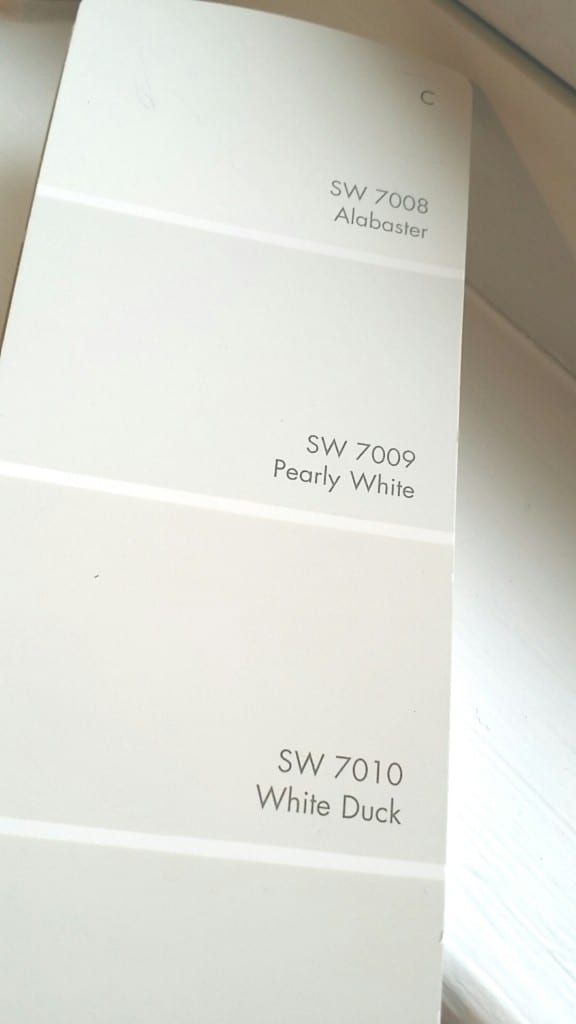
First I tried SW Extra White 7006 (which my trim and beadboard are painted in) because I thought it would be bright and airy for the entire bathroom. But when I painted one wall, it looked awful. It was way too stark and sterile looking. Then I was tempted to go with Sherwin Williams Alabaster which was voted Paint Color of 2016.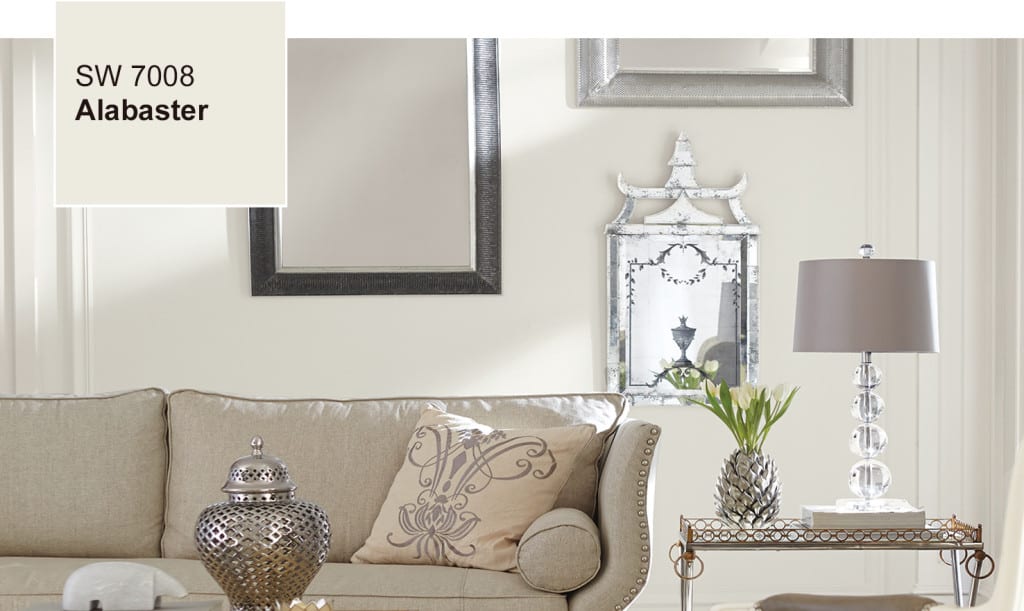

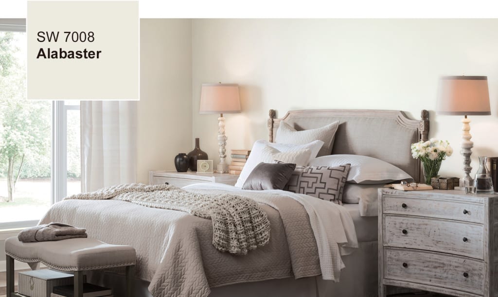
Alabaster is gorgeous but I wanted something slightly more beige – but not as yellow as the antique white that I currently had. So back to the drawing board of another 2 hours of going back and forth trying to pick a perfect white.
Long story short, I must have mulled over dozens of shades before I found my perfect white – SW Natural Choice 7011!!!
Now, my photo’s may not be as glamorous as the Sherwin Williams pics, but I couldn’t be more thrilled with my new bathroom color! 🙂

So, a big thank you to all of you who chimed in on my Confessions of a Creative Procrastinator…or should I say Creative Procratinator… {embarrassed laugh}. Your comments encouraged me to START painting my bathroom… yaaay!

My project is an RV: tiny spaces, lousy insulation, weak AC-s-and I live in south Texas where people can DIE om this heat? Silly me, I set my heart white spaces throughout–even made white cdotton canvas slipcovers for the sofa & my chairs. That was before I heard about undertones, LRV, and glare. Now I’m not so sure. Whagt I need is a cool white paint that won’t glare in my southern exposure.. Maybe it doesn’t exist. I prefer my LRV to be in the neighborhood of 60 – 65. I’ve always preferred beiges to grays (lived in Seattle for 40+ years.). But Texas is a brand new game where the idea is not to add warmth to a room but to cool it off. Top, I’m getting lots of conflicting information. For example, one “expert” says Alabaster’s undertone is yellow. Another says, no, the undertone is greige, another says it’s definitely warm, & another says is’s definitely neutral. I’m completely confused and I don’t feel like I can get a straight answer. What can I do??? Also, if I did paint my walls eggshell Alabaster, could I use a cool white for trim kitchen cabinets without creating a glare?
Hi Jude! I’ve been to Austin and the surrounding area two years in a row. Love Texas but luckily I wasn’t there in the wasn’t stifling heat. I heard it can be brutal. As for Alabaster and undertones, I don’t claim to be an expert so talking to the associates at say a Sherwin Williams or Benjamin Moore where you get your paint mixed would be your best bet. They know exactly what the color codes are and if there are warm or cool undertones. If you do your cabinets or walls in eggshell, it won’t create glare – its a flat paint. An RV sounds like a super fun project btw! 🙂
I am getting ready to paint a north facing downstairs family room. One wall is a light red brick. SW Natural Choice is my favorite. It is a low light room. Does it have red undertones, and will it pull red off the fireplace. Can’t find undertones for this color anywhere. Linda
I would describe SW Natural Choice with slight green undertones… at least in my bathroom with my lighting. If you’re curious how much red is added, I find the associates at SW super helpful. A quick call and they would probably be happy to tell you how much red is added. 🙂
We are leaning towards Sherman Williams Natural Choice color. Online I have seen many pictures and no two seem close in appearance. I need a good neutral that will go with almost anything. Is this a warm or cool undertoned color? How would you describe the color? Thanks!
Hi
I am deciding between, SW Natural Choice, White Duck or Creamy for my whole home. Could you tell me from your experience with Natural Choice, does it show quite grey? I have a North facing Great Room and Kitchen and I am afraid it will be too grey. Thanks.
Hi Janet, I’m considering this color as well but my entire house (pretty much) is north facing. Did you ever use this color and if so, how did it turn out? Is it warm or cold and dingy in your northern light?? Thank you!
OMG…it’s done…almost!! Still trying to learn “coping skills” (!!) for running angled trim on upper cabinets (Not Crown / Not 45 degree angles). And will school myself on glass tile after that… But what a transformation! Your Eider White was perfect for uppers, especially with SW Modernist Grey for lower kitchen cabinets….would love to send you pics$
Hi Denise….really enjoy musing all of your projects. They truly are inspiring!
I am embarked on a big one right now—I’m building new kitchen cabinet doors for my sister’s kitchen. Her china cabinet doors will have Shaker-style frames with glass panel inserts,, remaining uppers will have solid inserts and the cabinet lower doors and drawer fronts will have bead board panels. Her countertops are Carrara marble, so we’re thinking that a white paint with a grey undertone is what we’re after. I’m also thinking of using a dark (mocha?) glaze to highlight the bead board. I know that picking the right white is crucial—do you have a favorite that might fit this scenario?
Also, when antiquing the door with the glaze, will I need to glaze the entire door, or just in the beaded area? (I won’t be sanding thru the paint on the corners or edges–just want to emphasize the bead board.) Really appreciate your advice! I’m loving the building aspect of this project–and my Kreg jig!—and don’t want to screw it up with the wrong paint!!
Hi Catherine….great project! A gorgeous white with grey undertones is SW 7014 Eider White. Dark glaze will highlight the bead board beautifully and if you like a cleaner look, I would just glaze the beaded area. Maybe try a test board to see which glazing technique you prefer. Also, choosing a warm or cool glaze will make a big difference in the final look. Burnt Umber (has a lot of warm/yellow undertones) vs a dark cool Expresso glaze. Have fun and remember its only paint. Even if you start painting and it’s not the exact look your after, you can always paint over it! 🙂 {A tip I keep reminding myself…lol}
Hi, have you ever tried to distress grey over white paint? (i.e. paint white then grey and then distress)?
I restyled this table with a grey-wash but that was done with white and dark wax. I’ve never actually painted white and then grey but that would look phenomenal!
Wow,, the grey-wash is very pretty. Denise, I tried to contact you using the form, but I think there may be a problem there. Your blog has become such an important reference for me! Among, the plethora of info on the web, I trust yours the most. Now, I was wondering about something. Do you think it is OK to paint wooden furniture with acrylic paint (at times mixed with latex), and if so, is it possible to make chalk paint with it, to later finish off with polyurethane? Thanks! You’re so awesome!
Aww thanks Jennifer…that’s a huge compliment! And yes, acrylic is water based so it’s ok to use with these recipes or mix in with other water based paints. 🙂
Hi Denise! Well, I’ve been dabbing in the acrylic/chalk paint mix, and I think I’m ready to start working on a piece. Do you recommend a good yet economical electric sander? (or do you think using a small number grit sandpaper would do the job by hand)
Jennifer, my DeWalt sander is top-notch but I also have an inexpensive Skil sander that I really like too! But if you don’t refinish a lot of pieces, save your money and hand sand. 220 grit and just run it over your pieces as if you’re wiping down a kitchen counter to create ‘tooth’ for the paint to adhere to. 🙂
My favorite is Duron( no longer in business but can be color matched by any large paint chain) Shell White. Second favorite is Duron Arizona White. I paint all of my white furniture in shell white and the trim in our home is Arizona white.
I just love that any paint can be color matched! Your favorite Duron reminds me of a make-up scenario…you find the perfect blusher or lip stain and then they no longer make it. I wish I could bring in my discontinued makeup and have that color matched…lol.
Wow, Denise! Except for the wall color, that is my bathroom!!! Same beadboard, window placement and toilet!!! Hmm…mine does need a makeover…and I love the white you chose…I feel another project coming on!
haha…twin bathrooms! My entire home is in need of a makeover so tons of projects waiting for me! 😉
I’m with you, Denise. Picking the right white for a project is an art because it is, indeed, so much about undertones. So happy that you found the perfect white for your bathroom. Susie from The Chelsea Project
Got it right on the second try so not too bad…lol. 😉 Love your blog btw!
Hi
I plan on painting my cabinets, walls, ceiling, trim, SW shell white. Would it end up looking too creamy/yellow? I’m going for the monochromatic look to prevent yellower cabinets.
SW shell white is the whitest color available through the builder. If I select a whiter paint, I may have to pay an upgrade cost.
Other than painting the walls shell white, Iv have considered the other option of sherwin williams agreeable grey.
My countertop is dallas white granite which is a white background with flecks of grey and cream. My backsplash is subway tile in the color desert grey. My flooring is light grey wood like tile.
Would really appreciate any insight!
Thanks.
Denise, you nailed it! I like the choice you made looks really good in your photo.
Thanks Phebes…looks even better in person! Have an amazing weekend my friend! 🙂
You’re right, whites are so tricky! My husband and I looked at paints chips for both bathrooms, off and on for several weeks. The colors began to run together in our minds! The hall bath had been painted a very light, almost white beige, but it showed spots and scuffs so easily. We finally chose a new color by Glidden in egg shell, called “Tea & Honey”. It is a thick, premium paint with the primer mixed in. Excellent coverage! Glidden also has a barely off white that we liked for the other bathroom, called “Toasted Oatmeal”. It has a tiny bit of warmth. (We don’t work for Glidden.) I think the secret to choosing colors is to remember as you said, that some have ‘cool’ and some have ‘warm’ undertones. Choose the one that makes you happy when you look at it.
YES, “choose the one that makes you happy…” You just gave the best advice ever Bev!!! And thanks for the tips on the Glidden whites. The sheen I picked was also an eggshell. I’m a sucker for a flatter look and at least it wipes down easy enough.
Denise,
I painted my living room with Alabaster a few months ogo..Love it
It is a gorgeous neutral! 🙂
Have you heard of Maria Killam? She’s a colour expert based in BC. Check out her blog (http://www.mariakillam.com) for tons of information from choosing paint colours to selecting hard finishes (tile, floor, countertops, etc.)
I love this site. Thanks for the resource!
Hey, I like your photos better than SW’s. 😉 It looks great from the photos! So glad that you found a perfect white, still struggling with that a bit. Whites are so tricky, aren’t they? Good thing I have a bit of time before I’m starting on trim! =D
thank you haha…so everyone else reading this knows… I did NOT pay Zovesta to say that…lol. 😉