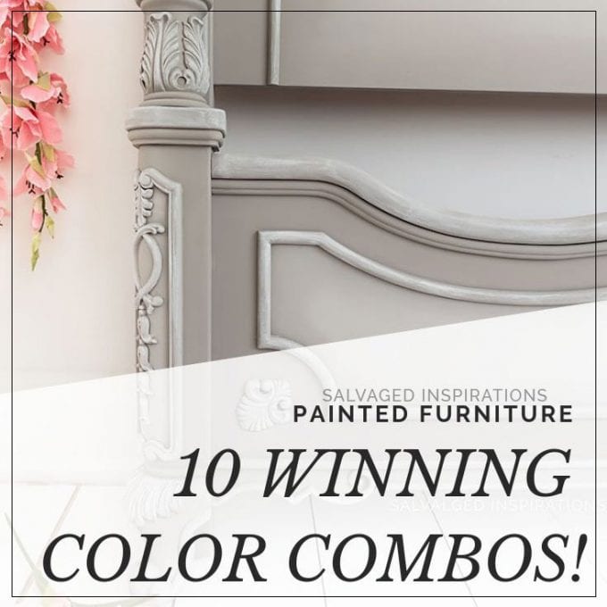
HOW TO PICK WINNING COLOR COMBINATIONS FOR YOUR PAINTED FURNITURE!
Hello creative friend and thanks for visiting! Let’s chat about picking a WINNING Color Combo for your painted furniture! I get a lot of questions asking what colors go together, what’s the most popular color to paint furniture, and what colors sell the best. Today I’m sharing 10 of my favorite combos’ that I’ve used — and a few others that I’ve seen, and love! I’m also answering a few of your paint color questions starting with the one I get asked the most…
What Color of Painted Furniture Is Most Popular?
When I started painting furniture I only used neutrals because they felt safe – creams and whites mostly. If this is where you’re at, great! The most popular paint colors in furniture are still the classics. White, black, beiges, creams, and wood tones. And if you sell your pieces, they sell extremely well too. Traditional paint tones will always have a place in home decor and furniture because it’s so easy to style. For example, can you guess what Dixie Belle’s most popular selling color is? It’s Drop Cloth – a gorgeous neutral! Check out this dresser makeover I painted with Drop Cloth here.
*This post was originally published on July 30, 2019. As an Amazon Associate, I earn from qualifying purchases. There may also be affiliate links in this post to other companies/products I use and love as well. You will never be charged extra when you purchase through these affiliate links. To see my full disclaimer, click here!
I you’re getting the itch to experiment and branch out, I know choosing colors that pair well together can feel intimidating, right?!!! I get it because I’ve made my fair share of mistakes. Truth be told, I’ve had to repaint my fair share of pieces due to ugly combos… but YOU don’t have to! If you’re curious to see my color mishaps, I’ve linked to a few of them at the bottom of today’s post under “Related Posts”.
10 FAVE COLOR COMBO’S FOR PAINTED FURNITURE
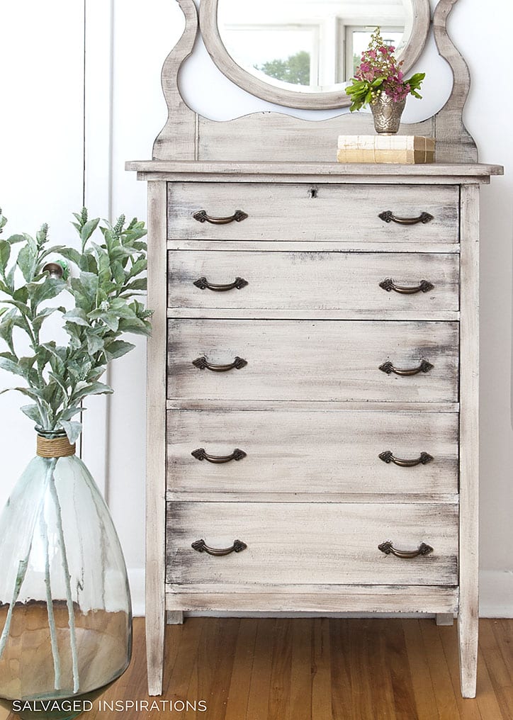
#10. FLUFF + SAND BAR
Here’s an amazing soft and neutral combo – Fluff and Sand Bar. If you’re looking to create a classic dreamy piece, these colors work beautifully together. You can check out the full dresser and blending tutorial [including the video] here.
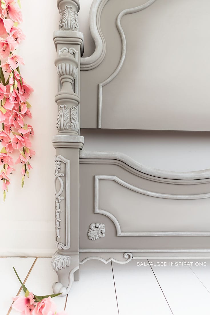
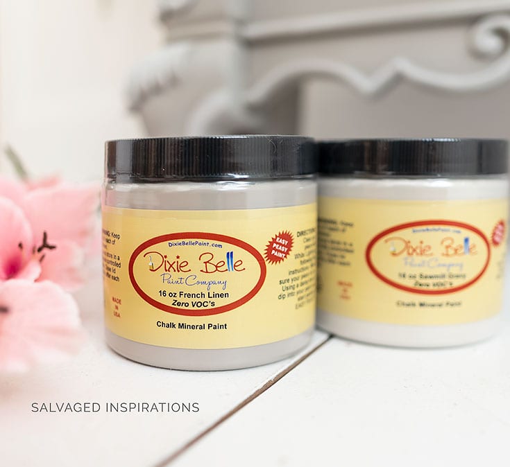
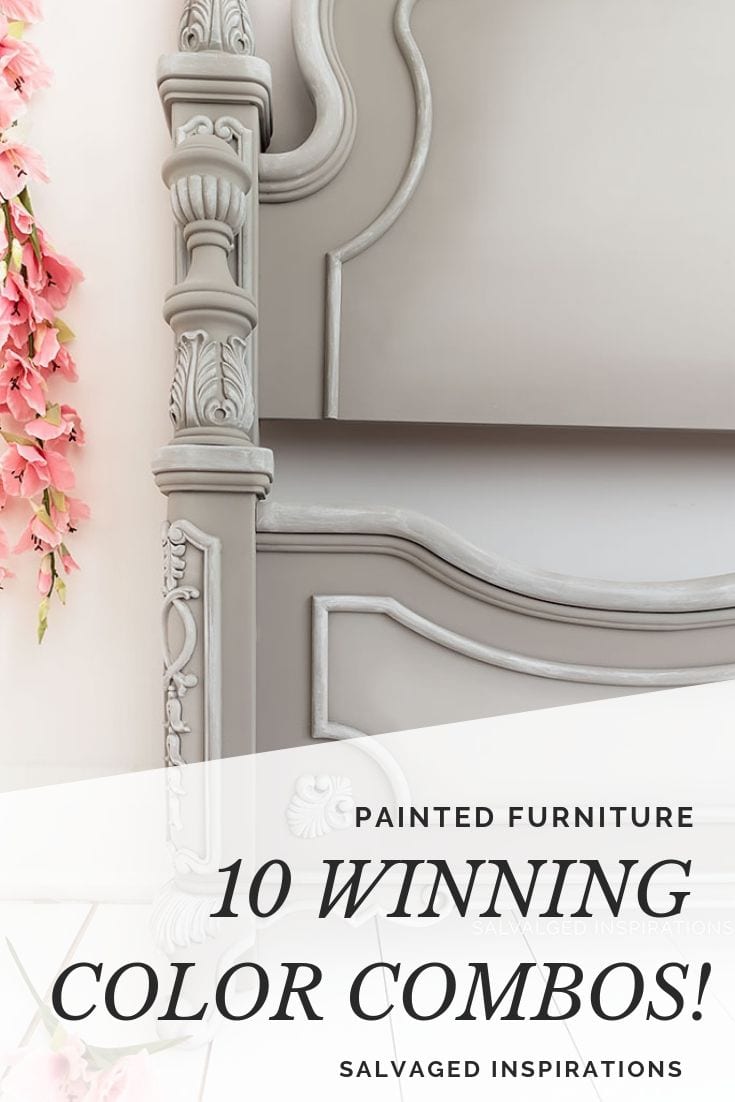
#9. FRENCH LINEN + SAWMILL GRAVY
At the time of this headboard makeover these 2 colors were SPANK’N NEW to the Dixie Belle Paint line. I can’t tell you how many times I’ve used this paint combo since because this is such a gorgeous greige neutral. French Linen and Sawmill Gravy are a staple in my paint arsenal!
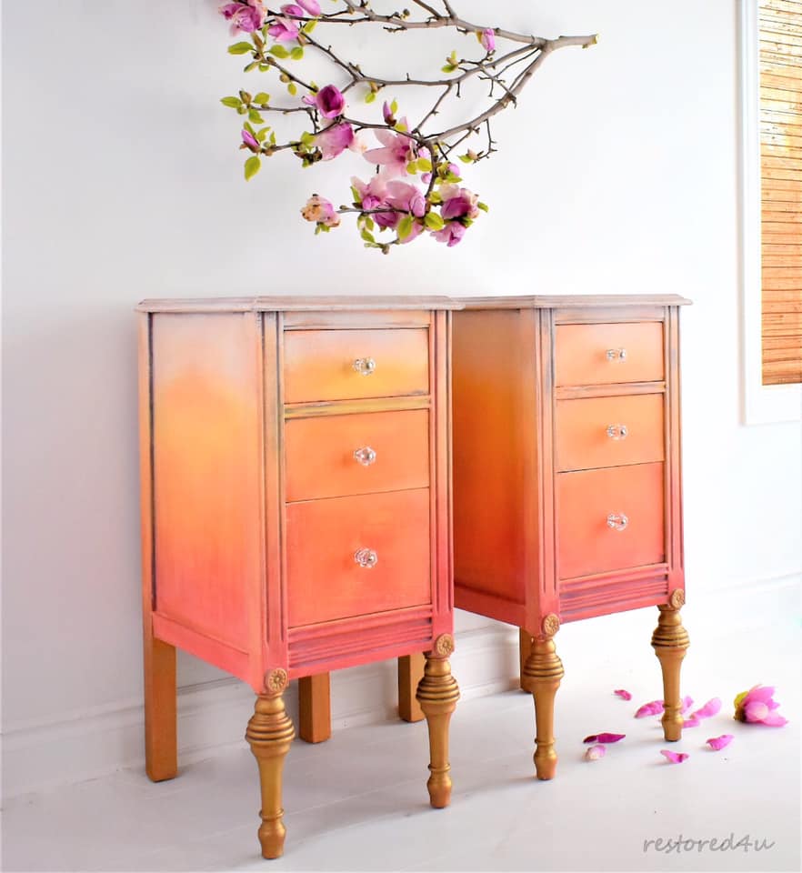
#8. WHITE + TILTON + BARCELONA ORANGE
Looking for a yummy sorbet kind of finish?! Check out what Ildiko from Restored4U created with this winning combo of Annie Sloan Colors. It reminds me of a gorgeous sunrise!
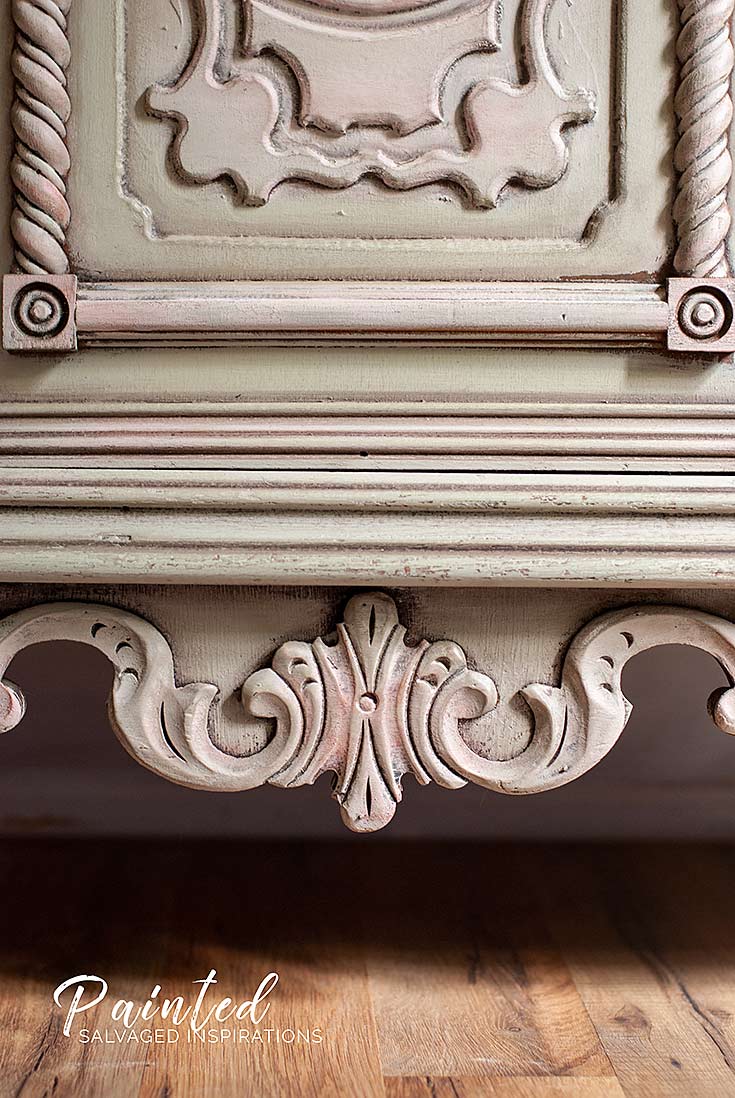
#7. DRIED SAGE + TEA ROSE
This Restore Buffet Before and After was blended in Dried Sage and Tea Rose and I’m in love. It’s an easy combo that creates a soft combination of beige/green with hints of soft rose. Tip~ if you want any of your colors and/or details to stand out, even more, try adding a light touch of gilding wax in a coordinating color.
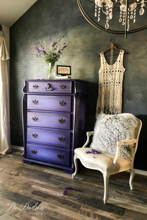
#6. AMETHYST + BLUEBERRY
One of my all-time favorite purple pieces is this gorgeous tallboy dresser restyled by my super talented and sweet friend Do at Do Dodson Designs. She used Amethyst and Blueberry to create this dramatic effect. You can check out all the details on this makeover here along with so many other gorgeous projects.
#5. COBBLESTONE + ENDLESS SHORE
Can you combine furniture paints to create a color?
Absolutely! And here’s a recent makeover where two paints were combined to make a custom color that pairs beautifully. Cobblestone and Endless Shore were combined to create this gorgeous modern chest color. It sold within 2 days of listing it and I received over a dozen inquiries!
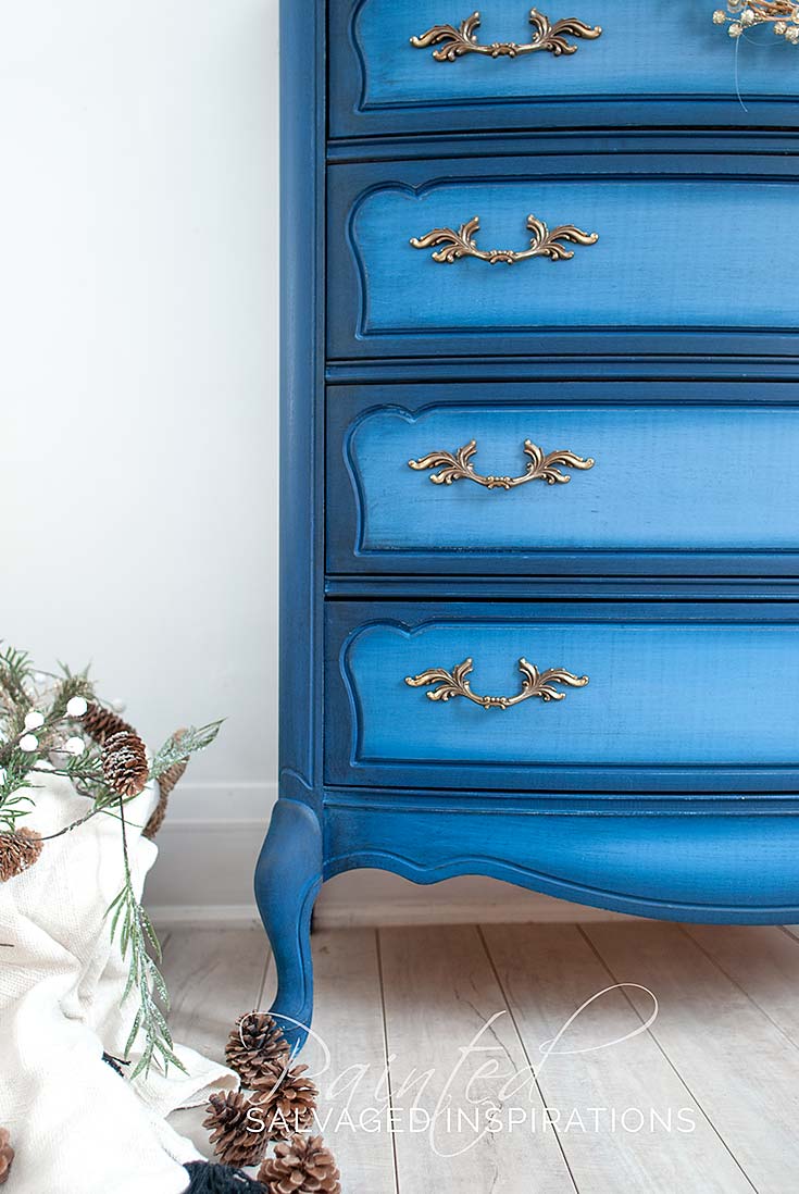
#4. BLUEBERRY + BUNKER HILL
Love blue? Blue is the color of the year according to Sherwin Williams and Benjamin Moore! These two blues blend beautifully together! This French Provincial High Boy was transformed by using a base coat of Blueberry and then blending in Bunkerhill Blue. Tip~ blending two colors can be as dramatic or as subtle as you like just by the amount of blending you do!
What Color is Replacing Gray?
Color trends go in cycles and gray was HUGE for many years. I see less gray furniture than I once did but that doesn’t mean gray is being replaced. It’s still classed as neutral and has its place in home decor. If you love gray, use it! However, if you want to hop on a trend, blues, greens, browns, and even rustic brown reds are super hot right now.
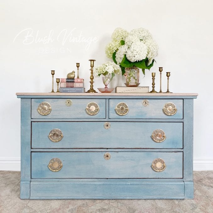
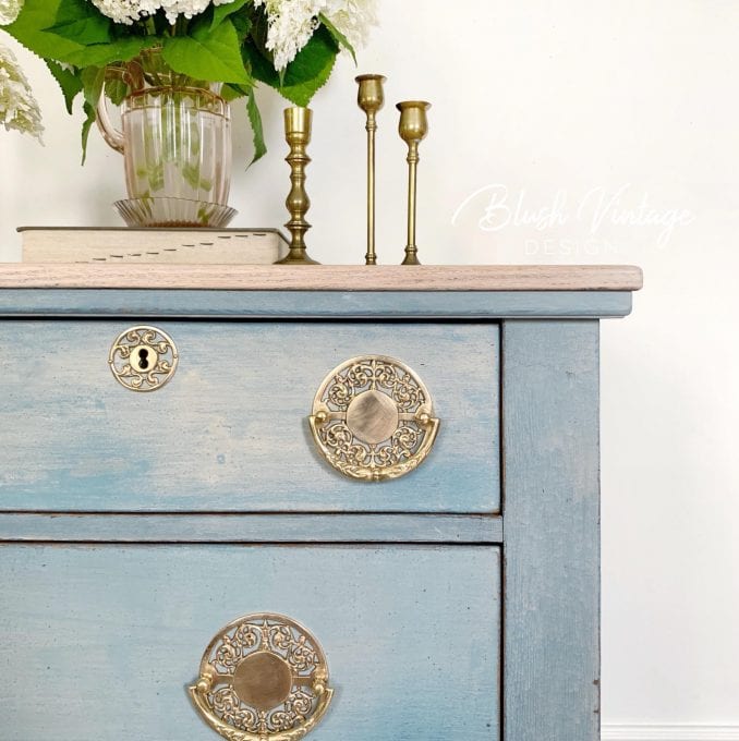
#3. MMS FLOW BLUE + GRAIN SACK + ARTISSIMO
Color combos aren’t just for Chalk and Mineral paints. Check out what Jeanne from Blush Vintage Design did with milk paint! Painted with Miss Mustard Seed’s Milk Paint in Flow Blue, a custom blend (Flow Blue, Grain Sack, Eulalie’s Sky and Artissimo), and finished with a watered-down wash of Schloss, this piece is heavenly.
Can I Have Light AND Dark Furniture in The Same Room?
Absolutely! Light and dark furniture can create a gorgeous and classic combination. Dark blues, greens, rustic reds, browns, and blacks can add warmth and richness while light gray, beiges, creams, and whites can brighten a space and make it feel more open. Mixing light and dark furniture and decor will create a timeless and inviting look!
#2. FRENCH LINEN + COFFEE BEAN
For this thrift store sewing cabinet, I combined French Linen with Coffee Bean to create this gorgeous finish. They paired together seamlessly and what a beautiful result. The finish looks like a RH finish! You can see the full tutorial included video here.
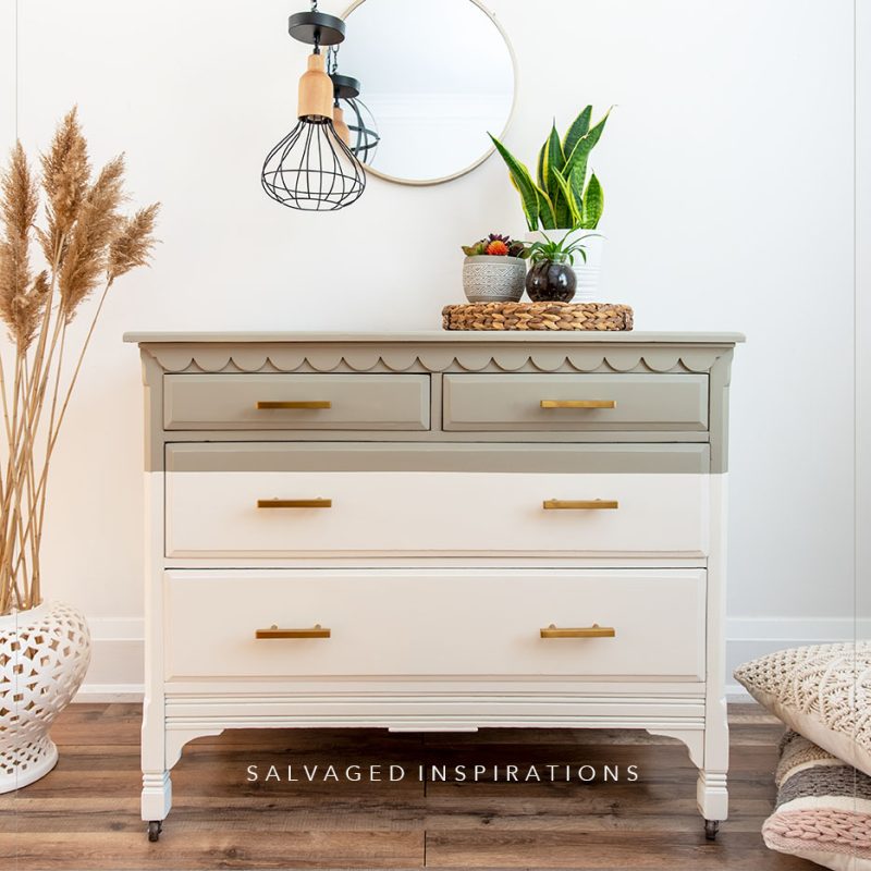
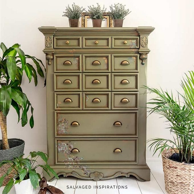
#1. HAMPTON OLIVE + ENDLESS SHORE
This two-tone dresser was painted in Hampton Olive and Endless Shore which make a fun duo! These two colors can be paired together in a variety of ways but side by side, they complement each other and make for a modern neutral look. Check out the full tutorial here.
5 BONUS COMBINATIONS!
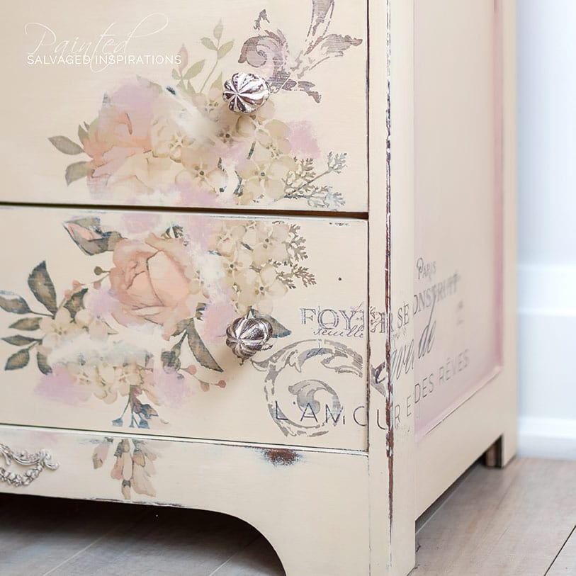
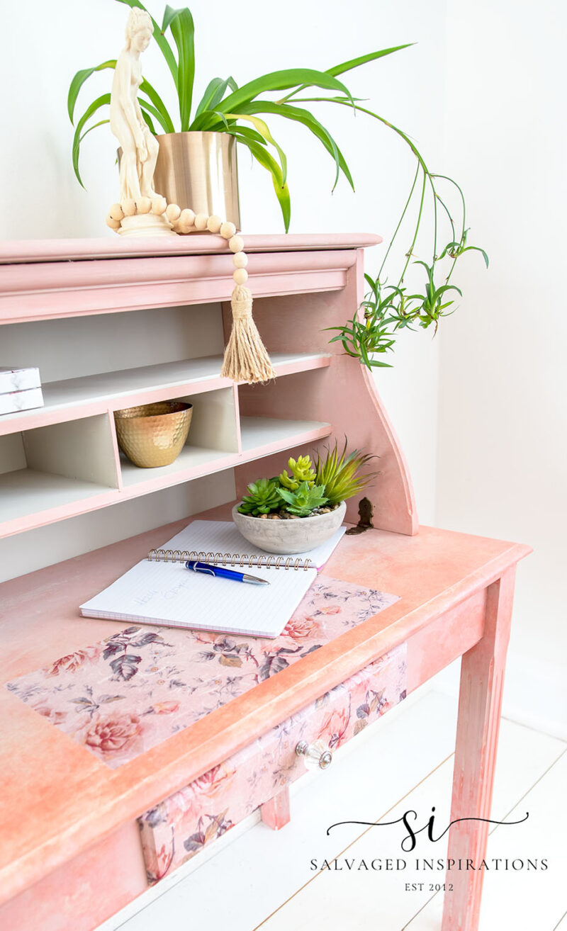
#1. OLD OCHRE + TEA ROSE
Tip~ you can always mix paint brands so long as the base formula is the same ie water-based with water-based. Years ago, this flip-top desk was originally painted in Annie Sloan’s Old Ochre. The flat paint job wasn’t doing a whole lot for me so I put it to the side. Then a few years later, I had the urge to give this desk some character, so I added a blend of Dixie Belle’s Tea Rose and some floral transfers. This is a great duo if you’re looking for a warm neutral with a soft pink added in.
#2. REBEL YELLOW + TERRACOTTA + COLLARD GREENS
This is one of my all-time favorite curb-shopped makeovers. The color combo on this piece was inspired by YOU, all of you who chimed in on Facebook. This is a great warm autumn look, don’t you think? This winning combo was created using Rebel Yellow, Terracotta and AS Olive… but you can get the equivalent and substitute with DB Collard Greens.
#3. DROP CLOTH + SAND BAR
The brown wax that creates texture on this piece may trick your eye away from this paint duo, but believe me, if you’re looking for a winning subtle beige duo, Drop Cloth and Sand Bar are a winning combo! They look great layered or blended or even individually painted side by side. You can check out all the details on this DIY Weathered Wood dresser here.
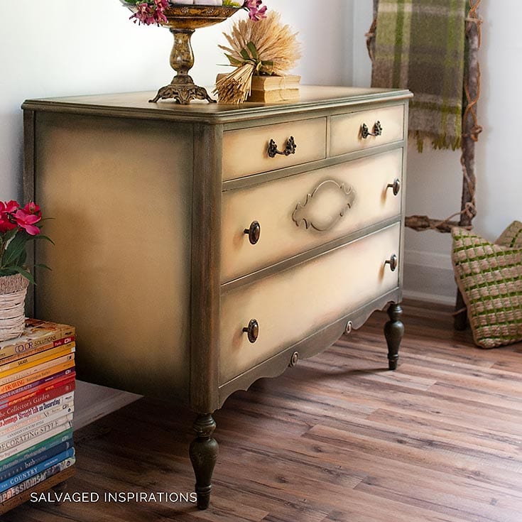
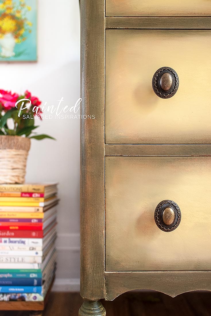
#4. SPANISH MOSS + TERRACOTTA
If you’re a fan of green, this color combo is earthy and rich. I used Spanish Moss, Terracotta and Stormy Seas which complement each other beautifully. You can check out how I layered all three colors here.
#5. SAWMILL GRAVY + TEA ROSE + COTTAGE DOOR
And I had to include a sweet bonus paint combo! This thrift store desk and hutch got a feminine makeover for Breast Cancer Awareness Month. Dixie Belle has generously sent me their “Florals For A Cause” decoupage paper which was the inspiration for this desk makeover. 🎀
Color creates a mood so when picking your colors, go with what you love and what makes you happy. Referring to a color wheel can be helpful, but I also like to keep in mind that Mother Nature has NO color wheel. Everything seems to go with everything and looks perfect… so follow your heart.
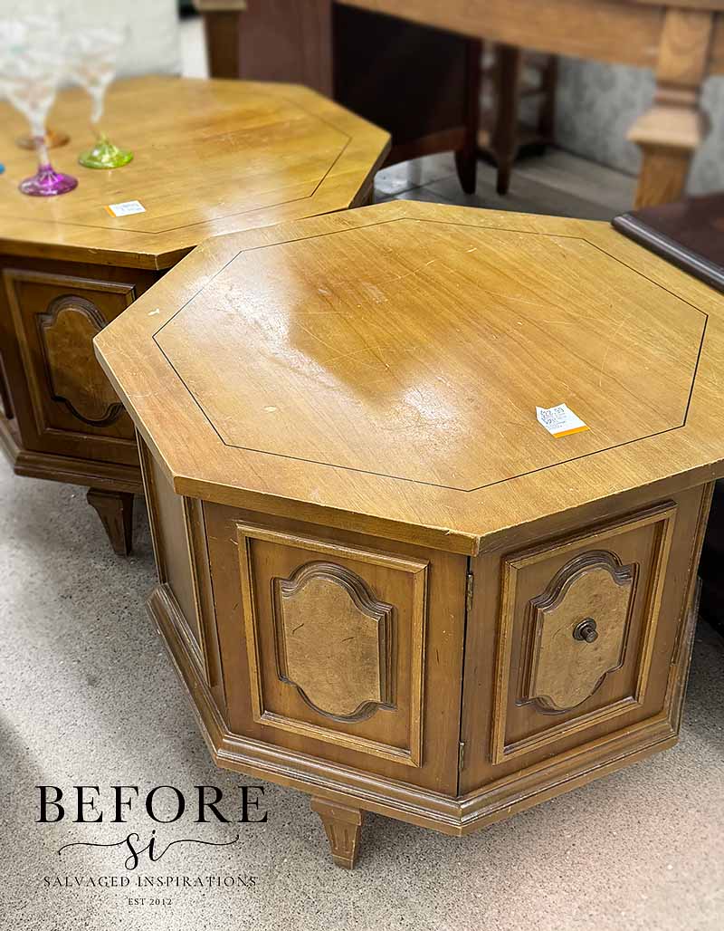
I’ll be back this Thursday with my Furniture Fixer Upper crew. I picked up these tables from my thrift store and am working away on them. I can’t wait to share because I’m trying something I’ve never tried before. See you then!
I HOPE THESE COLOR COMBOS HAVE INSPIRED YOU! IF YOU HAVE ANY FAVORITE COLOR COMBINATION YOU’D LIKE TO SHARE … I ALWAYS LOVE HEARING FROM YOU.
Thanks for reading. 🙂
Wishing you a beautiful day filled with inspiration and Happy Painting friends!
Denise XO
RELATED POSTS::
DIY Dresser – 80’s Tallboy Makeover
How To Fix Furniture Painting Mistakes
Mustard Seed Yellow Take 2
Some Bad Takes and Some Good Advice
PIN AND SHARE!

You are so talented. These are beautiful. I’m partial to the neutral ones. My favorite is the headboard in French Linen and Sawmill Gravy. It’s gorgeous.
That’s one of my faves as well! I painted it when the colors just came out, they were brand new and I fell in love. I always have these colors in my inventory now. Have a super day Lizzy! XOXOX
I love your work they are all beautiful. Can you tell me if you have done a tutorial on painting a fireplace Tim I mantle? Would love to see it if you have.
Thanks for sharing the valuable information. I was Looking something like this.
Good luck
Hi Denise. I apologize if this post appears twice! I accidentally hit delete (I think). I have been doing an Internet search for “painting furniture” and came across your website I love your tutorials and projects ! I have a few furniture painting projects coming up and I could use some inspiration and suggestions . I have an old kitchen dining set: in need of some love! Solid oak pedestal table and six spindle back Windsor side chairs The top of the table looks pretty rough from years of completing craft projects with with my children. We are talking dried glue, glitter, water marks, etc. Everything else is in good condition I want to update the set for a more modern, fresh feel and also cover up all of the wear and tear. What colors or color combinations would you suggest? I would like to stick with the neutrals like white, cream, espresso and black. Gray is a “maybe“ My kitchen cabinets are espresso. I’d also like to avoid sanding and priming, so I have been looking at chalk paint, but I’m open to other suggestions. I would appreciate your thoughts and thank you in advance ! Thank you too for sharing all your wonderful ideas with the rest of us!
Hi Liz! I think a really sharp (and more modern look) is to paint the bottom in a neutral cream or white, and then sand the top and stain it to tie into the rest of your decor ie gray or expresso/java. If you go with the chalkpaint idea, the bottom wouldn’t require sanding or priming, only the wood top. 🙂 It’s a gorgeous look imo. 🙂
Congratulations on your artistic taste .
Thanks, Morteza! 🙂 Super talented furniture painters featured… love their pieces. xo
Thank you for the feature, my friend! Great blog post and I love all the color combos. xo Do
Thanks, Do! And thanks for sharing your creative talent… your purple dresser is stunning! XO
How wonderful to revisit some of your gorgeous color combos, Denise! As I was scrolling I thought, oh that was my favorite…and then I’d scroll more and say the same thing…and again…and again. LOL The love of bright colors and all things summer has me in swooning over Restored4U’s sorbet piece. If only I had the courage to be so bold!
You’re too sweet Marie, thank you. 🙂 And yaaaa, aren’t Ildiko’s nightstands amazing!? Those colors… I’m swooning too!
Hi Denise,
The French Linen combo will be my undying all time Favorite Forever!!!! And #3, also a pale creamy combo gets my second place favorite! But the French Linen bed headboard,/footboard is out of this world! Love, love love it!
I’m in love with these new Dixie Belle colors as well Judy! Soooo classic and elegant… can’t go wrong pairing these colors. XO 🙂
Thanks for this post! I,too, think nature has no color wheel. I tend toward neutral colors, but love every single one of these🤩
Thanks, Toia! I totally get people using color wheels and trying to coordinate colors, but for myself, when I overthink color, it rarely turns out for me. Yet when I remind myself of mother nature and pick colors I’m ‘feeling’, sometimes the most unexpected matches make for the best looking pieces.
That blue chest! Then the Tea Rose one . . . LOVE those! Some of the colors are just not me, but the techniques are wonderful! The Barcelona Orange for example. The technique is gorgeous, but I would personally never use orange. I’d pick something that had a blue undertone because those are the colors I love! That’s the fun of DIY, we get to pick the colors and techniques that we love! And even if I never do any projects of this magnitude, I love seeing what you do. It’s inspirational. And it keeps me coming back to see what you’ll do next.!
Hi Teckla!! That is the fun of DIY furniture. Inspiration comes from all types of colors and techniques. 🙂
I love the headboard/footboard. How did you paint the scrolly mouldings on them so perfectly? I can’t find the answer anywhere.. Thanks.
Thanks Lizzy! I used “Vintage Lace” Chalk Paste included in this tutorial here. 🙂
Hi Denise. You are so right when you say “nature has no color wheel”. I couldn’t agree with you more. I love these color combos and appreciate you sharing your expertise!
Thanks, and isn’t that the case! Every color goes with every other color in nature… and always looks amazing. XO Have a super day my friend. 🙂
Beautiful colors. I too love the pale basic colors but recently have gone to blue and greens. I love the combo lok will have to try that next
Hi Dee! If or when you give one of these color combos a try, I’d LOVE to hear how it turns out for you!